Nothing but pretty pictures

Some times, the less said, the better.

This is one of those times. I’ll be prattling on about cooks, books, travel, the pandemic and more the next time, but today I’m sharing images I’ve saved from Instagram and some I’ve taken myself. I’ve tried to put these in some sort of order or context. Enjoy! (I hope!)

Armchair travels to Paris

Anyone who knows me, knows I love Paris (and the rest of France). As I was skimming thru images on my iPad, I realized I save a lot of photos from Paris (this is a small sampling), so I thought I’d share just a few favorites.

This image of the Tuileries, left, reminds me of a grade school art class on perspective. It also captures the symmetry and order of Parisian parks. It  I love the way the plane trees are perfectly planted and pruned and the dappled shade they offer. The ground is just gravel and there are no other plants, at least in this view. But the effect is simply elegant.

Below, two cafes I can honestly say we have visited more than once on more than one trip. They are both on the Right Bank. Cafe Nemours, left, is just a block or two from the Louvre and perhaps more casual than Bistrot Vivienne. We have made more than one weary afternoon stop here in search of rest and refreshment. Tables are tricky, because it’s always busy. They’re also very close (not at all pandemic seating) and we inevitably strike up a conversation with someone on one side or the other. This is on a broad square, excellent for people watching.


Bistrot Vivienne and the adjacent Galerie Vivienne are in the 2nd Arrondisement. The Bistrot has charming seating on the street (for people watching) as well as inside (where we have had dinner at least once). In the back of the Bistrot, adjacent to the galerie, are several tables, all open to the sky and to the shops in the galerie, which include a legendary wine store whose name escapes me. We’ve also had dinner in this courtyard and it is lovely.

In the Instagram garden & mine

I often save Instagram images of gardens, although this can be more than a little frustrating. There is no way I can begin to replicate some of these plantings in my suburban yard.  On the other hand, if I could finally convince my husband to build me one of these tuteurs, below, it would certainly dress the space up!


I’ve always been a sucker for a picket fence, even better if it’s backed by a tumble of plants. I also like gardens that have a predominant color, like white (below, left) or purple. Aren’t the foxgloves gorgeous?


I’ve been working on my own white garden (except for those purple perennial geraniums that snuck in) for a few years. In fact, the astilbe and hosta are so well-established, I think I’ll have to move a few of them.


I’m one of those gardeners who takes an early morning walk around, often with coffee, clippers, or camera in one hand, to see what is or is not growing or blooming, I have found it’s a good way to catch up on small garden chores, like weeds before they get out of control and cutting back spent blooms. And honestly? I’m retired, this is a luxury I waited to enjoy. And sometimes you are rewarded for your efforts, like these daylilies still sporting morning dew.


Instagram inspiration

My IG feed is pretty limited, to places I like, gardening, decorating and collecting. (I think of FaceBook as the repository of everyone’s family vacation pictures.) Keeping that in mind, IG is like a daily magazine I flip thru for ideas and inspiration. There is always plenty to “like” and even comment on. Sometimes I save an image, though I’m not always sure why. Here are a few recent saves:

I like kitchens that aren’t too “kitchen-y” and artwork and silver are one way to up the ante.


Years ago our first house had a guestroom/den covered in 60’s brown faux paneling (and I’m being generous here).  A designer I knew suggested I counter the brown with a wedgewood blue area rug. In fact he found me a carpet remnant that I had bound to do the job. Wow! From cave to cozy! That was my introduction to blue. From there it was just a hop, skip and jump to blue and white, to transferware against brown wood, and so it goes. So I loved this room from Eric Cross with the blue and white on and under a dark buffet and those chairs upholstered with  blues and green on the brown background.


While we’re speaking of dark wood (and we are, right?) I just discovered Steve Cordony. Although his taste is a little edgier/modern than mine, I love the look of dark wood against pale or white walls. In fact I have liked and/or saved a number of similar shots. I  find that look calming and a great way to show off other decorative elements in the room.


Then I looked thru some photos of my own house and realized I was doing a lot of the same look.


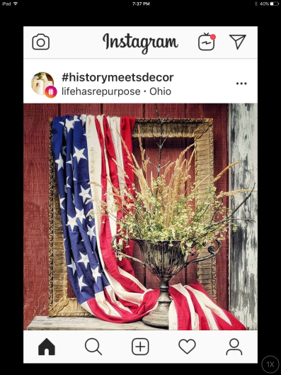
And finally, let’s hear it for ironstone, especially decked out for summer’s patriotic holidays. I love the way this collector has unabashedly gathered pieces large and small, even piling tiny creamers into a bowl, and stacking tureens. What a happy collection!


So, that’s what you get looking thru my Instagram: armchair travel, garden ideas, and a bit of decorating thrown in.  I’ve probably said too much, but once a writer, always a writer.

What about you? What draws your IG or FB attention?

Thanks for stopping by. Stay safe & see you soon!


Fall started with a manicure

My husband gave me this bowl years ago, and I really do love it! It’s perfect for big, mixed arrangements.

I stopped for a manicure the other day, then realized, as I was heading back to my car, that Trader Joe’s (which shares the parking lot) had an interesting variety of pumpkins piled outside. Of course, I checked out the display and they were even more appealing up close, not to mention well-priced!

And that was the nudge that pushed me into fall.

In truth, I had already picked up a few cute pumpkins and updated planters with mums, the latter because the previous blooms had totally withered in the last of summer’s heat. Now, however, I was into the new season. I cut two big buckets of drying hydrangea blooms and arranged them into several plump bouquets.

More than that, however, I began my quest for my own pumpkin patch in the front yard. It’s a challenge to see how many different kinds of pumpkins I can find — green, pink, white, orange — and I also have to protect them from from nibbling by squirrels, rabbits, and whoever else stops by for a bite of pumpkin. And don’t get me started on how easily specimens with soft spots or tiny breaks in their skin can readily rot into messy, mushy piles. (If it sounds like I have had experience with this, you are right.)

Here’s the font yard patch: three different oranges and a pink (!!!) pumpkin.
This is my patch from a few years ago.

This year I armed myself for serious pumpkin protection (or maybe I just need a hobby?). I washed them with soapy water seasoned with a splash of bleach. After they were dry, I spread them on a drop cloth and sprayed them with a clear coat sealer. I have no idea if these precautions will work, but they come from other bloggers who seem to know what they’re talking about. (Which really means they take their seasonal decorating much more seriously than I do.)

Pumpkins getting the “preservative treatment.”

I’ve also done my best to spread some autumnal cheer inside. I have an admirable collection of dried gourds, collected over several years, that I rely on for inside scene-setting at this time of year, but they are currently trapped under the basement stairs behind bookcases and toolboxes re-located for the duration of our drainage repairs (which should be wrapping up in another week or two. Hooray!!). So instead, I’m using more pumpkins, fruit, fresh and faux leaves to set the scene inside.

I piled my ceramic pumpkins from Berea, Kentucky, along with some some baby boos and a few real ones here on the antique dresser in the living room.


Then I thought about how good orange looks with blue and white, so I tried this in the dining room.


Finally I paired one of my buckets of hydrangeas with these pumpkins on the back porch!

Most importantly this has fed my puttering/tweaking gene, which spills over into a bit of fall cleaning, polishing and generally dusting-up. (My grandma would be pleased.) My house needed the attention and I needed the “therapy.”

I’m so glad I stopped for that manicure!

Thanks for stopping by. See you next time?

It’s good to be a girl & other July musings

My daughter and I at Chicago Shakespeare this spring. I just need to brag about her a bit below.

Actually, it’s good to be a woman. “Woman” is more politically correct, but “girl” suits my copywriter’s alliterative habits. So, why is it good? Have you followed the news this week?

Congratulations to fifteen-year old Cori “Coco” Grauff for beating Venus Williams in her opening round at Wimbledon. She is the youngest player ever to qualify for the legendary tournament and credits Williams with inspiring her to pick up her first racket. And, she’s continued to win! It would be easy to call this a Cinderella story, but you don’t get to Wimbledon without talent and a lifetime of hard work. And when you continue to win, you’re on your game!

Then there is the U. S. Women’s Soccer Team. I must admit I am not a huge soccer fan. Back in the day, when my kids played, I never really understood the game and I still have not acquired a real appreciation for its finer points. (I had to give up soccer for volleyball and football!). But I am overwhelmed by the athleticism and competitive drive of this team. They play hard every minute of every game. And they play together. And it shows.

Sometimes Mom just has to brag

My daughter Maggie is a photographer by avocation and regularly shares her photos on Instagram. (In fact, after she got me going on this blog, she nudged me onto IG too!) Thanks to IG, she’s been invited to share her work at an upcoming Chicago showcase. How cool is that! Here’s a sample of her shots around the city.


My IG view of the Fourth

I’ve spent a little (or a lot?) of time lately, sitting on our shaded porch and cruising through Instagram, enjoying a variety of takes on red, white and blue in honor of the 4th of July. Here are a few favorites.

First, I love this display of a beloved family flag.


I’m sure if I looked in the right folder I would find the original shot of this wall-mounted flag. I know I tore this from a magazine. I love everything about it: the flag (of course), the bench below it, the open landing and that beautiful railing. Isn’t it amazing how a single magazine page can come back to us so many years years later and its appeal is as fresh as ever?


The flags here are a nice, subtle salute to the season, but what I really love about this image is the cabinetry. I want those shelves and their neat, glass-paned doors.


Shirley is a fabulous flower arranger, so it’s no surprise that she can turn a handful of flags into a bouquet in blue and white. She even arranged them in moss! The result is crisp and summery and perfect for the entire season.


So, how is your holiday weekend shaping up? It’s warm and summery here, the garden is flourishing, and we’re off to the beach soon. Yes, it is July!

Thanks for stopping by. See you next time?

Lately: Reading, cooking, and decorating my way out of cabin fever

Spring can’t come soon enough.

I’ve lived in Chicago all my life and winter weather — including snow, ice and bitter cold — is something we just learn to live with. However, this year’s temperatures have challenged the hardiest of us. I honestly cannot remember a time when sub-zero temperatures and wind chill hit 50-below, when the Post Office announced it would not deliver mail and the garbage trucks simply stayed put and these lapses had nothing to do with two feet of snow on the ground.

As my grandson would say, it’s been epic!

Although we have certainly been able to get out for groceries, go to the gym, meet friends for breakfast, lunch or dinner, we have often done so in bitter cold or sloppy snow. With boots, gloves, hats, and scarves. This is fun and adventurous early in the winter, after a few months it gets old, at least for me. Most of all, there have been too many days when we just couldn’t go out. When no one could.

Cabin fever is no joke.

When I look back at what I have done lately, most of it has been centered on coping with cabin fever. First, of course, I read. Pachinko by Min Jin Lee was a book club read and, like so many of them, it pushed my typical reading choices. This multigenerational story about Koreans living in Japan (where they were viewed as second class citizens) recounts one woman’s life decision and the repercussions on her family for generations to come. I knew very little about the history of either country, so this was especially eye-opening for me. Pachinko was a little tough starting, but ultimately a compelling read.

Then I read Eleanor Oliphant is Completely Fine by Gail Honeyman. Never assume. This was appearing on so many reading lists, I thought it would be one of those best seller/easy/fun reads. It was all that, but more. Eleanor is way more complicated than the heroine I was expecting. Yes, she has an amusing lack of social skills. Then she crosses paths with co-worker Raymond. (I know, this is sounding contrived, right?) Slowly, their growing friendship begins not only to reveal her terrifying past, but also the importance of human connections.

I’ve moved on now to House of Broken Angels by Luis Alberto Urrea. I’ll keep you posted, but so far, so good.

I’ve been cooking

In fact, I cooked so much I had to start passing out “samples.” I made Ina Garten’s Winter Vegetable Soup twice in one week. It was just that good! I made the first batch per all of her instructions, minus the pesto which I did not have. The second time, I tweaked the recipe a bit, substituting potato for some of the squash. It was just as good! (I did take Ina’s suggestion to use homemade chicken stock, and I do think it makes a huge difference!)

Since we really can’t live by soup alone, I also made beef burgundy and a batch of meatballs. I would have continued, but the freezer was quickly filling with the soup, homemade stock, etc.

So I turned instead to decorating…

And I re-hung this gallery in the stairway to our finished basement. I am the only child/only grandchild and therefore keeper of family photos. My mother-in-law also passed along boxes of photos to me. These riches are compounded by the fact that my dad was quite the amateur photographer. He had a small darkroom in our house and he enlarged/cropped and otherwise tweaked his own photos as well as old negatives that my mom unearthed. It was a lot of fun for all of us. But it also resulted in a lot of photos. I’m really drowning in prints, often multiples of the same image (though I am increasingly successful at weeding those out!).

Some of these have been hung here right along, some have been displayed on tabletops, others were stashed in the back of closets, behind dressers, under beds — you name it. Would it surprise you to learn I have a few more to add to this? My goal has been to save the best and get rid of the rest. Let’s just say I’m making progress.

My Instagram feed

And, yes, I’ve spent far too much time this winter on social media, which for me is Instagram. I’m sure I’ve mentioned before that my IG feed is pretty narrow, no celebrities, few FaceBook friends, a lot of designers and lifestyle bloggers. I’ve saved some screenshots, so I could share my favorite finds.

Anyone who has successfully grown a geranium in a porch pot is desperate for spring and the garden season after a winter like this. If you love gardening or decorating, I encourage you to follow Jenny Rose Innes, from Bowral, Australia. Her home(s) are stunning and her gardens beautifully lush. I was initially struck by the brick path in this image (I love the way it periodically cuts into the beds on each side), but I also thought that if my garden just looked this good in green, imagine how it would look when those plants bloomed!


I often think that “go big or go home” is a good rule in decorating. Look at the impact this big but simple bucket of lilacs has on this room. It’s not overpowering (though the fragrance must be wonderful), it’s placed to be seen but not in the way, and it beautifully balances the stone wall, wood floor, and baskets.


Elizabeth blogs at blueandwhitehome.com. Both her blog and her IG feed are populated with beautifully-appointed, mostly blue and white rooms. She’s traditional, sometimes with an edgier feel, and her daughter, who also contributes to the blog, has a similar aesthetic. Elizabeth also generously introduces a number of her favorite designers, like Caroline Gidiere Design. (Yes, I’m a little obsessed with this room: the gallery, the blue and white and that green!)


James T. Farmer is an interior designer, gardener, author and speaker whose work is always infused with a gracious, southern sensibilty. His IG is as likely to feature photos of his dog, whatever he’s cooking or eating, and/or his extended family and friends as it does images of his design work. This image says it all! (Check out his latest book, A Place to Call Home.)


Wouldn’t you love to attend or host a dinner party featuring this lovely table? Enough said.


Finally, Joni Webb — whose awesome blog Cote de Texas is, well, awesome — posted this image (and several others) of an apartment belonging to the late Lee Radziwell. Is there anyone else out there, of a certain age I suppose, who heard a door quietly close at the news of her passing?


And that’s my lately. What are you doing to combat cabin fever?

Thanks for stopping by. See you again next time?


The thrill of the hunt

You may have seen this on my Instagram.

There’s nothing like one great antique or vintage find to whet your appetite for more. At least that’s how it works for me. One thing just leads to another…

About a month or six weeks ago, I happened upon this blue and white pitcher. In fact, you may have seen it on my Instagram feed. There is something about both the colors and the patterns that is distinctive from the rest of my blue and white transferware. It’s hard to see the detail in the image, but the lip of the pitcher is actually scalloped!

I haven’t had a chance to really research the manufacturing stamp on the bottom, so its real value is still elusive. And I need to be clear about my “antique” hunting. Most of it is just old stuff that catches my fancy, suits my style, calls my name. I don’t have the budget (or at this point even the space) for the $1200 antique Swedish cabinet my friend and I saw last weekend, even if it was truly wonderful!

My porch cabinet, where I keep some necessities and some “fun stuff.”

I have a few more finds in my porch cupboard (a very old, not-at-all-sturdy cabinet basically held together by myriad coats of paint) where I keep paper towels and glass spray to freshen up the dining table, cocktail napkins, an assortment of small vases and flower frogs as well as a flower pot (on the bottom shelf) of hand tools for the garden. (My idea of porch necessities!) I recently added a few more vintage vases to the other pieces on the top shelf. (My husband collected the vintage fans. The larger one needs re-wiring, along with a third one on his workbench, but I thought they looked cool on the porch. Pun intended!)

But wait, there’s more!

Last week I went to the Randolph Street vintage and antique market on Chicago’s near west side. This is a monthly market in the summer and I have attended sporadically for years. Sometimes there are great finds, sometimes not so much. The merchandise is definitely more vintage (30’s and 40’s) than antique, and there are a number of vendors selling old, repurposed, industrial pieces. This is definitely the place to go for “loft-sized” artwork, kitchen islands, coffee tables and more. Last week I saw at least six beautiful, old, oak drafting tables (sorry, I forgot to take any pictures). Fun to look at, but not really my style.

I also picked up that crusty industrial wastebasket behind the print. So much more character than more current versions.

Surprisingly, however, this is where I bought many antique french linens in the past. (One vendor used to come once each summer. Her selection was amazing!) I’ve also found great prints, as well as some fun lamps. Last week I found this sweet little water color, currently residing on a shelf in the dining room.

I also found two neat baskets. One is huge — 23″ by 16″ by 13″ deep — and needs some repairs. I’m going to have to glue the leather straps back in place at the ends of the handles. It also has some loose pieces on the bottom; perhaps from being dragged? I haven’t decided how to handle that, except to treat it gently overall. it’s big enough to hold some pillows on the porch or quilts at the foot of a bed,  but I could also put it atop a cabinet to look neat and out of the way of further damage.

And since I found one basket, I picked a smaller one up from the same vendor. It’s really a nice shape and size, perfect for magazines. I don’t know about the rest of you who shop at similar venues, but if I find one thing at a booth, I often find more from the same vendor. It probably has a lot to do with companionable aesthetics. (Price negotiations are also a little easier when buying more than once piece.)

The big find…

Of course, I’m always looking for transfer ware and ironstone. Nothing last week. Lately I’ve been searching for small vintage vases like the ones in my porch cabinet. I was sure I’d find some at Randolph Street, but no. If there were any, I did not see them. However, I did spot this bistro table and four chairs early on and I could not get it out of my head. Was I looking for something like that? Not at all. Do I have a good spot for this? No!

There are actually two more chairs to go with the table, and all of them are surprisingly sturdy.

I looked at it and walked away. Then I met up with my antiquing buddy and showed her. She agreed it was fabulous, insisted I should really buy it and negotiated a better price (she knows this vendor). I still walked away. We looked at other stuff, stopped for a cold drink, and while we were taking our break my friend asked if I was still thinking about the table.

“Yes,” I said. “And I’m thinking I’d better go buy it.”

Actually, it’s really charming in the yard, propped with a plant. I absolutely love it. My husband does too. We’re just assuming we’ll come up with another place for it.

Most of us who shop antique markets have a mental Rolodex of the pieces we didn’t buy. We were indecisive, couldn’t think where to put it, or someone else snatched it up. But the best shoppers/collectors/decorators offer the same advice: if you love it, you’ll find a place for it. They’re right. That’s the way antiques (or any collectibles) are. They’re really kind of insidious, worming their way into your heart, your home, and finally into a corner of the family room.

What ever it is that you collect, happy hunting! Thanks for stopping by. See you next time!


Hero Worship

What do basketball and interior design have in common? It’s actually pretty simple. 

Starting in the 4th or 5th grade and continuing for several years, my basketball-loving son enthusiastically followed the career and athletic achievements of Michael Jordan. (Who am I kidding, in the late eighties and early nineties we all loved #43!) His basketball feats seemingly had no limits. There were gravity-defying gymnastics that invariably ended with a basket. But there was also the ball handling, the competitiveness and the work ethic. (I know this because Doug watched tapes of his plays again and again and again. They were the soundtrack of my life for quite awhile.)

Hero worship is something we all occasionally fall into, and, depending on the hero, it’s not all bad. We might learn some new skills and/or acquire some new interests, etc. So it’s hardly surprising that my love of dishes, fabrics, furniture, color and design — really all the decorative elements — have led me to my own group of decorating heroes.

The essence of French country, with the cheery (and cherry) reds, the check and toile fabrics, the curvy legs on the table in the foreground, charming accessories layered into the bookshelves and on the tables.

You may recall that I wrote here about the influence Mary Emmerling had on my early decorating, but she’s not my only design hero. If you checked my bookshelves, you would see that Charles Faudree is clearly a favorite. I’m not at all sure I have ever succeeded in recreating his lush, layered designs, but I’m happy to keep trying.

For those of you who may not be familiar with Faudree, he is an American designer known for his colorful take on country French interiors and credited by many for popularizing the look. I had admired a number of his rooms in magazines like Traditional Home for some time before I realized that they were all the work of one man.


You may recognize this from my post on transferware. Charles Faudree is the inspiration, at least in part, behind my collection..


Faudree’s designs feature a lot of center tables like this one, above, in a library (often the way he referred to an office or study) and, below, in an entry. The table tops are always decked with books, flowers and other meaningful brick-a-brack. I don’t have space for a center table, but I have toyed with similar arrangements atop our dining room table and on side tables.

Different spaces, same aesthetic


One of the things I appreciate about Charles Faudree’s designs is his ability to translate his aesthetic into different settings. The image above is a very traditional dining room, but the photo below features a more contemporary, voluminous space that still maintains his country French design.


Not all Faudree rooms are huge nor are they perfectly proportioned. I love the sunroon, below, but it’s clearly a narrow space.

And what wonderful rooms, furnished with beautiful antiques, plush couches and chairs always topped by a variety of pillows in a companionable array of colors, patterns, textures and trims (always trims — elegant tapes, fringe, tassels, ruffles, etc.). So many thoughtful details.


No room is too small or insignificant, no corner too obscure to escape his treatment. This would not work at my house, but I love the powder room below, especially the little Napoleon on the vanity, not to mention the sconces and wallpaper. Why shouldn’t a small powder room be so completely imaginative?


This transitional space, below, which could be clumsy in accommodating a distinct change of level, is instead totally charming; with chairs and a lamp it’s the perfect place to have a cup of tea or leaf through a magazine.


Despite his motto that “More is never enough,” Faudree often allows  a distinctive antique or piece of art to stand on its own. I think the Swedish secretary, below, is from one of his own homes. And look how he allows the brooding Lincoln portrait to dominate the space.


But that “appropriateness” just one aspect of his aesthetic. For me, the real art of Faudree’s talent is in his attention to detail, perfectly placed objets d’arts, picture frames, figurines, cache pots, mementos, etc., all chosen to reflect the interests of the homeowner as well as the overall design. Many are pricey antiques, others are family pieces or flea market finds. (Truth to tell, I think the tension between high end and low end in one room or even one vignette makes a powerful statement.) In his hands, all of this fits perfectly into the greater design scheme. It’s personal, it’s layered, it’s thoughtful.


I’m not advocating assembling and displaying “stuff” for the sake of “stuff.” And I don’t think Faudree was either. But I do think that rooms devoid of artwork, photographs, books, collectibles from a hobby or travel tend to have a very sterile look, as though anyone could live there instead of the individuals who do.


This was the back entry to his own mountain cottage, but look at the style and personality he paired with function here.

I never tire of paging thru his books, reading and re-reading his comments about how or why various elements combined into the finished design. I always learn something new, about wall arrangements or color or collectibles. I also find that I am more than a little charmed by his impish personality, stories from friends and associates about buying trips in France and his prankish sense of humor. This is someone I really wish I could have met.

Sadly, Charles Faudree died in 2013. (I know, think of the rooms he could have designed, the books he could have written!) But, you can enjoy his many books from new and used sellers and even the library. Titles include: Charles Faudree Home, Charles Faudree Details, Charles Faudree Interiors, Country French Florals and Interiors, Charles Faudree’s Country French Living, Charles Faudree Country French Signature, and Charles Faudree Country French Legacy. 

What about you, who or what inspires your interests?

Thanks for stopping by. See you next time!


Lilies, links and a new artist


Sometimes it’s the bits and pieces and not the “big picture” that capture my attention. Here are a few things that caught my eye this week.

An artist to watch

This past Sunday Steve and I headed downtown to meet some friends at the Millennium Art Show (which was really an excuse to catch up, walk around bit and then grab something to eat.) This was a small show but with some really interesting pieces and I’m sorry I didn’t spend more time seriously looking at the works displayed. Hmmm, perhaps we were chatting more than looking? However, I did enjoy re-discovering Daniel Lai.

This piece by Daniel Lai is called “Teach a Man to Fish.”

Lai is a Tennessee artist who enjoys sculpting and repurposing books into the most amazing pieces of art. I first saw his work at the Wells Gallery at the Sanctuary on Kiawah Island. His work is so distinctive that I immediately recognized him at the show on Sunday. He says he started playing with books as a bored student, then was encouraged to re-purpose some of a friend’s books. I’m charmed by his imagination, the many ways he uses books and pages, those wonderful clay figures and the little extras, like the fishing pole. I think his work is both whimsical and provocative. What about you?

I captured the images, above, of his work from screen shots on You Tube. I wanted to share a few more images of his work and my photos just didn’t do it justice.

Three links to visit

I have been known do lots of blog-reading and coffee-drinking in the morning. Last week I was giving myself a real break after several especially busy days. And here’s the fun, my email inbox was full of links to some great blog posts.

Karianne at Thistlewoodfarms always has a fun take on life (she’s also a wonderful photographer and shares amazing DIY projects). She did a great post on 5-minute cleaning tips. I loved this, because she mentioned the messes that you (or at least I) forget about (like Cheerios in the silverware drawer). I also love the idea of limiting cleaning chores to 5 minutes. Click here for her tips, and if you have a 5-minute tip, please share!

This is just a sample of Jackye Lanham’s work that I found on the web.

Joni Webb at Cote de Texas did yet another of her beautiful, well-researched and illustrated posts, this time on designer Jackye Lanham and her home in Charleston, SC. First, Ms. Lanham does beautiful work: elegant, traditional rooms, minus the do-not-touch museum look. You would like to live in her rooms and her Charleston house, well, just take a look at the post! This is pure eye-candy. Pour a cup of coffee and just enjoy. (Joni’s posts are always a mini-course in art, architecture and design. She did a remarkable post on the real homes and rooms behind The Crown.)

Finally, Elizabeth at Blue and White Home, has a wonderfully clean, easy, mostly-traditional-but-sometimes-modern aesthetic (she’s also a Chicago designer, yay!). One of her recent posts turns that look onto some floral arrangements she made from blooms in her parent’s Vermont garden. They are simple, unpretentious, infinitely doable and most of all really pretty. It’s one thing to go to the store for a few bunches of flowers and greenery (we all do it all the time), but quite another to create such pretty pieces from what we have growing in the yard. Check them out.

The “stars” in my garden

My garden has a few spectacular successes this year, as well as a few failures. I don’t know if it’s the weather or, more likely, my not-so-green thumb. However, I walk the garden daily, sometimes taking pictures, often cutting some blooms to bring inside, pulling assorted weeds and dead-heading spent flowers. Not surprisingly, the stars of this year’s garden are the daylilies, and these purple coneflowers that are popping up everywhere. Take a look:

I hope you’re finding some “fun stuff” in your inbox and enjoying these July days!

Thanks for reading and see you next time!


Blue & white is just the beginning

nhillbluewhite1
Nell Hills photo.

My blue & white transferware collection started accidentally.

Back in the decorating dark ages, before Pinterest, Houzz, Instagram, etc., I studied design magazines in search of inspiration and ideas. When stacks of magazines threatened to overwhelm the various baskets, shelves and cabinets where I stuffed them, I would page thru each issue, tearing out favorite and/or appealing photos and drop them into a file. (Sometimes I wasn’t even sure why I liked them, but I saved a lot of pictures.)

Many photos were like the ones at left and below. Eventually, I realized that often the rooms I admired featured blue and white transferware and I decided then that acquiring some of these accent pieces could go a long way to getting the “look” I was after. So, when I saw affordable pieces at antique markets and second hand shops, I snapped up what I could.

faudreeplatescabin
Charles Faudree design published in Traditional Home.

What are we talking about here?

Transferware describes a type of pottery, most often plates, cups, vases, serving pieces and the like, decorated by transferring a detailed engraving from an inked copper plate to the blank pottery before firing. Although initially I was attracted to these pieces because of the blue and white color, I have come to appreciate the technique behind transferware. (Can you imagine the skill required to create the detailed engraving and then transfer it?) Lidy at The French Garden House offered a more expert explanation of this here. (The photos she includes of her collection are wonderful, and you can check out the pieces she has for sale on her website if ayou click on the “Shop” tab.)

The pieces of red and white transferware below illustrate the detail that went into many of the designs (I especially like when designs are repeated inside a piece as on the left). If you look closely at the piece on the right you can see that the design was not perfectly applied; it’s crooked on the bottom. I suppose it makes it a little less valuable, but I think it also reveals the hand-work that went into this piece.

redbowlinsideout redbowlsm

Most of the pieces I have collected are from England, but others are French and some are American. I think there are just greater quantities of English transferware in the marketplace. Many of these pieces were manufactured for the 19th Century’s growing middle class. Bigger, more elaborate pieces and designs were created for the higher-end market. (There’s always a higher-end market!)

transferwaregrapes

It did not take long for my transferware collection to reach beyond blue and white to encompass a number of red and white and brown and white pieces as well. I’m not sure why a particular piece “calls my name.” I’m often attracted to a plate or platter by the detailed border of the design or if a piece is shaped by scallops or fluting. These days I am searching out shapes beyond plates and platters. The compote in the image above is a new find. Some pieces are antique and others are reproductions. I guess I’m an equal opportunity collector!

3sugarbowls

These sugar bowls are a great example of my haphazard collecting. They share a common shape. Although the red one is round it also has a fluted base and the red and blue versions both have interesting lids. Sadly, the brown piece is missing its lid, but I really admire the crisp detail in its design.  It’s much sharper than the other pieces. And look at the upswept handles on each piece! I’m crazy abut these details!

Sometimes transferware designs use more than one color. I found this fairly large bowl on a cold, sometimes rainy day at an end-of-season antique market. It’s less than perfect (you can see where it’s chipped). However, I loved the rich colors and the floral pattern which continues inside the bowl. I snapped it up for less than $50 (it pays to shop in the rain!) and it has been the star of the china cabinet for several years since. Or at least that’s the role it assumes when it’s not holding fruit or a holiday centerpiece.

multibowl multibowlinside


bluerustThis blue and orange plate is a more recent find. It’s proof that blue and white transferware rocks the orange/rust shades of autumn.  Unfortunately, it has no identifying mark on the back, but it shows significant age.

My attachment to transferware drove some of the design decisions I made during our kitchen renovation a few years ago. I insisted on the “mantle” over the stove so I could show off a few special antique pieces. And I chose the green tile backsplash because it looked so good with the transferware. (Yes, I shopped for tile with a small plate in my pocket!)

thumb_DSC_0543_1024

I’ve been thinking about what drives this particular collection for me. It started with color and certainly that continues to play a role, but I also love the process behind these pieces and the fact that some of these designs are so well-loved, they are often revived in contemporary versions of their antique forebears. It’s also clear that some of my pieces are well-used, and I like to think that someone long ago set their table with the same plate or platter.

redplate

This is another favorite plate. It has the kind of details I really like: a fluted edge and that remarkable light and dark pattern that repeats on the lip of the plate. Lately I’ve been trying to pay more attention to these design nuances when I find something new to add to my collection.

I should add a disclaimer here that not everything in my collection is vintage or antique. I do have a number of reproductions, including all of the ginger jars that I display with some of the larger platters.

lrtransferwareAfter I snapped this photo of a number of pieces I show off in the living room in my grandmother’s china cabinet, I realized that whether I consciously intended to or not, I continue to channel those photos I’ve saved. Compare this image to the one from Nell Hills at the opening of this post!

This collection is not especially valuable. I’ve acquired the pieces in a haphazard, whatever-is-affordable way. And, clearly, it has morphed considerably from my first purely decorative purpose. But like any collection — cookbooks, garden plants, quilts — it has been a joy to acquire and I can’t imagine our home without it!

See you next time!