
Whenever I post a picture of some of my blue and white porcelain on Instagram, I receive so many positive comments, I thought perhaps it is time to explain how this collection (and the other blue and whites in our house) came to be. Blame my mother.
Actually, that may be too simple an answer. I have always gravitated to classic navy blue. And, as so often happens, the way we dress carries over into the way we decorate. Over the years I had two blue and white couches paired with two different blue and white loveseats in the family room. When I finally bought a “good sofa” for what turned out to be our long-time living room, it was covered in a blue and white Waverly fabric. I used the same fabric on the windows in the living and dining rooms as well as companion wallpaper in the dining room. It was very matchy-matchy.
So it was hardly a surprise that my visiting mother got bored one day while I was at work and my kids were at school and took a field trip to TJ Max. She found these ginger jars, along with a smaller jar and a candlestick, long since disappeared, and promptly re-styled our mantel. (And you wondered where my decorating gene came from!).
I liked the look and thus began my quest for a blue and white plate here and a small pitcher or biscuit box somewhere else. Those were the years of some of my most intrepid antiquing, and the smaller plates and pieces were easy to find. As so often happens with a collection, I found myself refining my taste, checking the manufacturer’s stamps on the bottom of new finds and limiting my pieces to those from England.
I began to collect little blue and white moments like this…

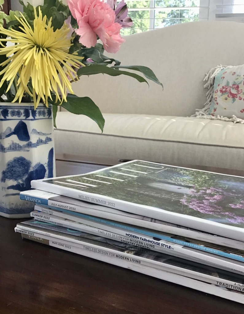
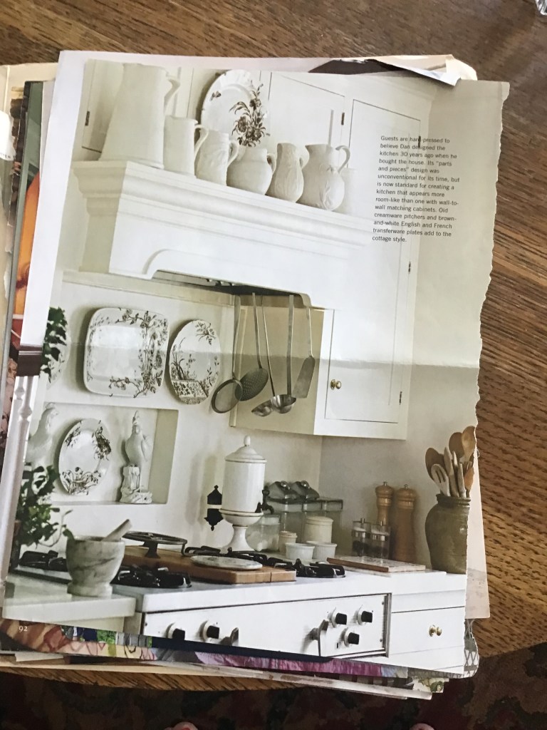
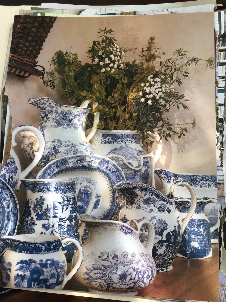
Perhaps most importantly, I began to save images of blue and white collections. This was in the pre-Instagram world, so I saved pages from magazines. This is a favorite, below. It’s not just the quantity here, it’s the variation in detail: floral or scenic patterns, straight or curved shapes, small spouts or larger, more graceful ones, shades of blue that range from the palest to deep indigo.
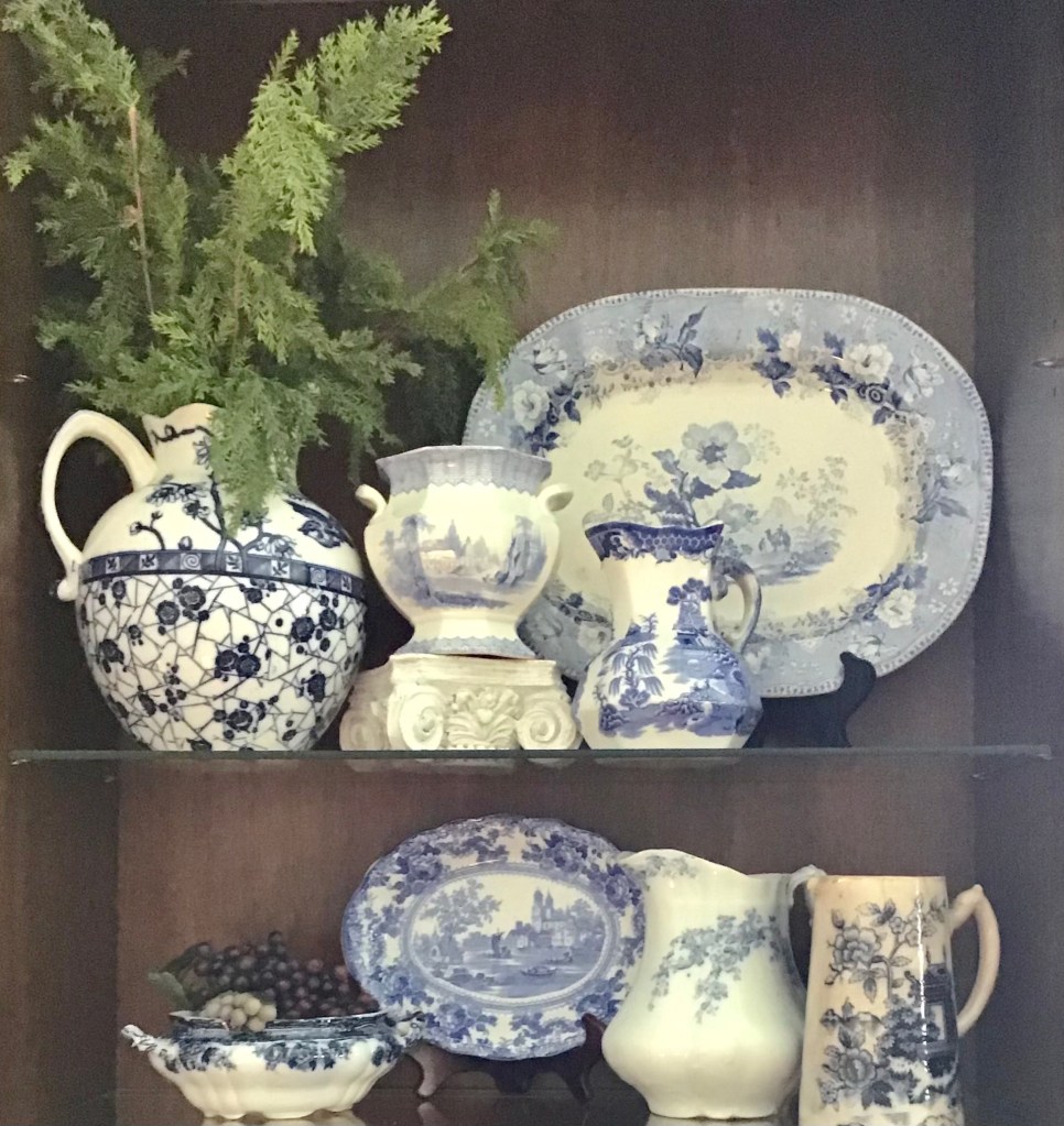
I gradually moved on to larger pieces, like trays and larger pitchers. As the pieces multiplied, I was able to “gang them together” on shelves and in cabinets.
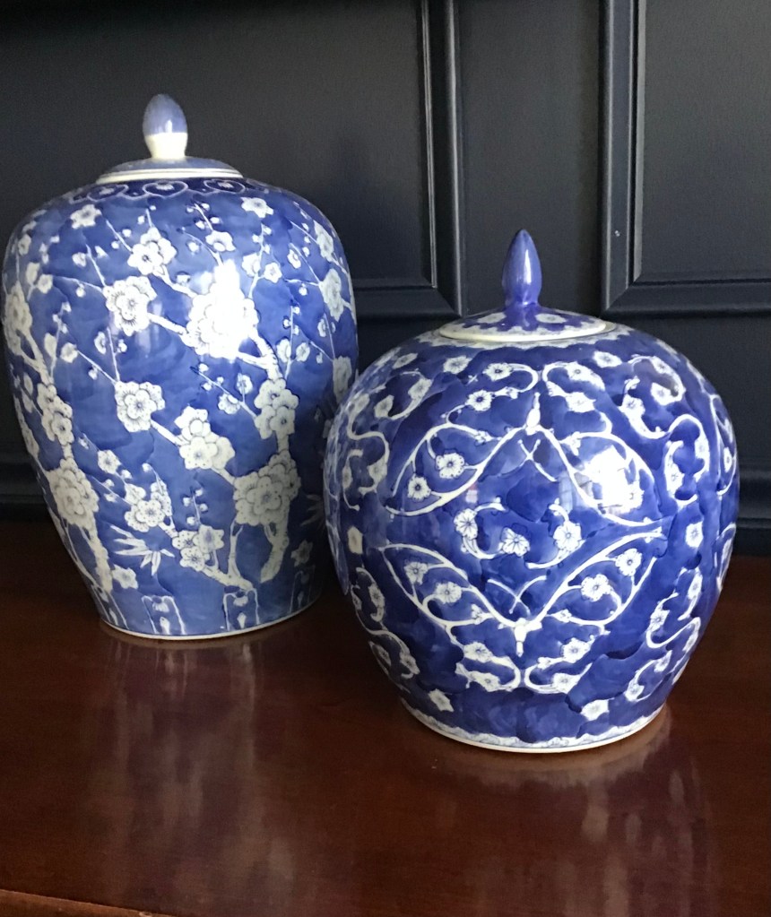
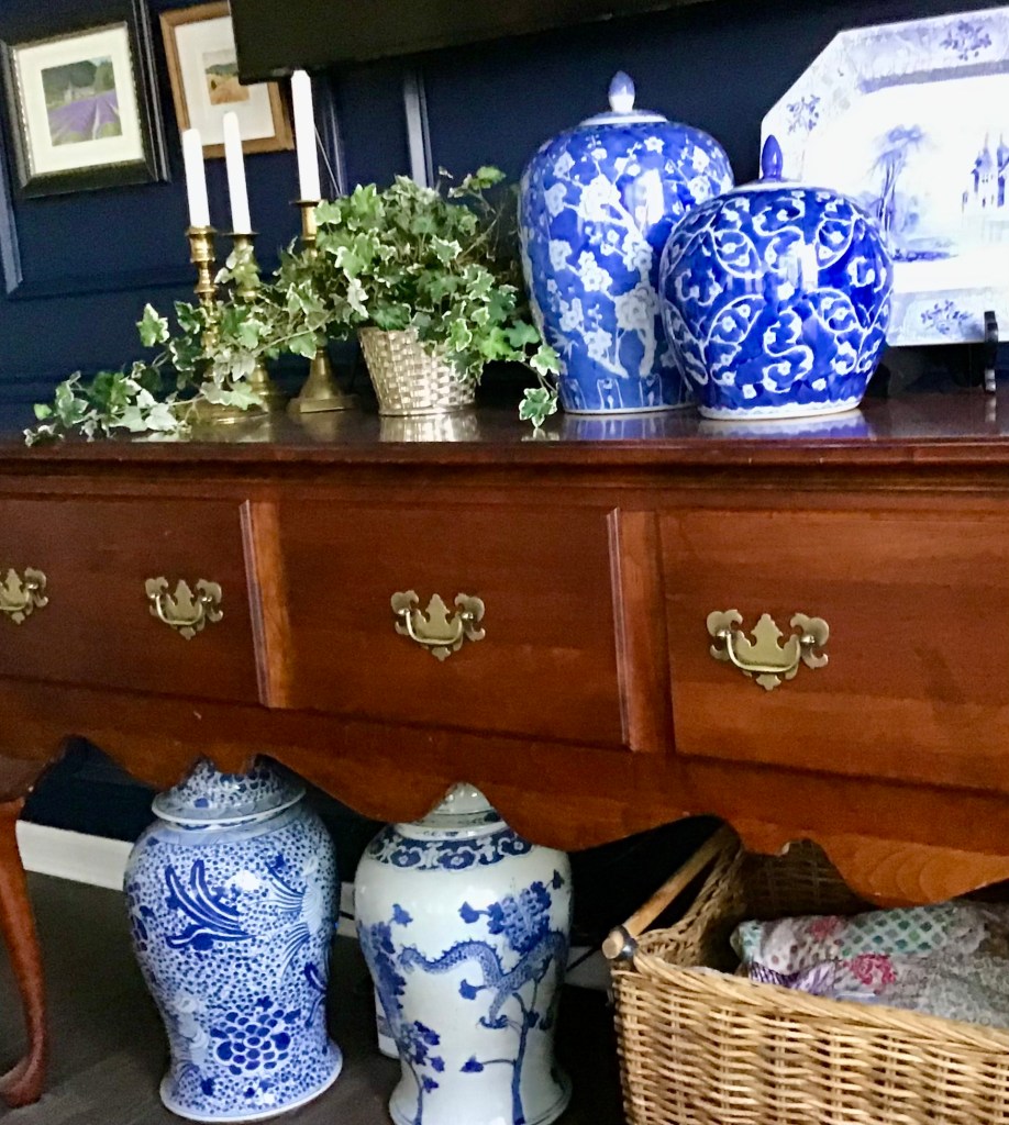
Blue and white inspired the navy feature wall in our current great room. The two really large ginger jars are not antique, but at some point I decided I needed a statement piece. I ended up with two and I’m so glad. (As Charles Faudree would say, always buy pairs when you can, even if you don’t use them as a pair.)

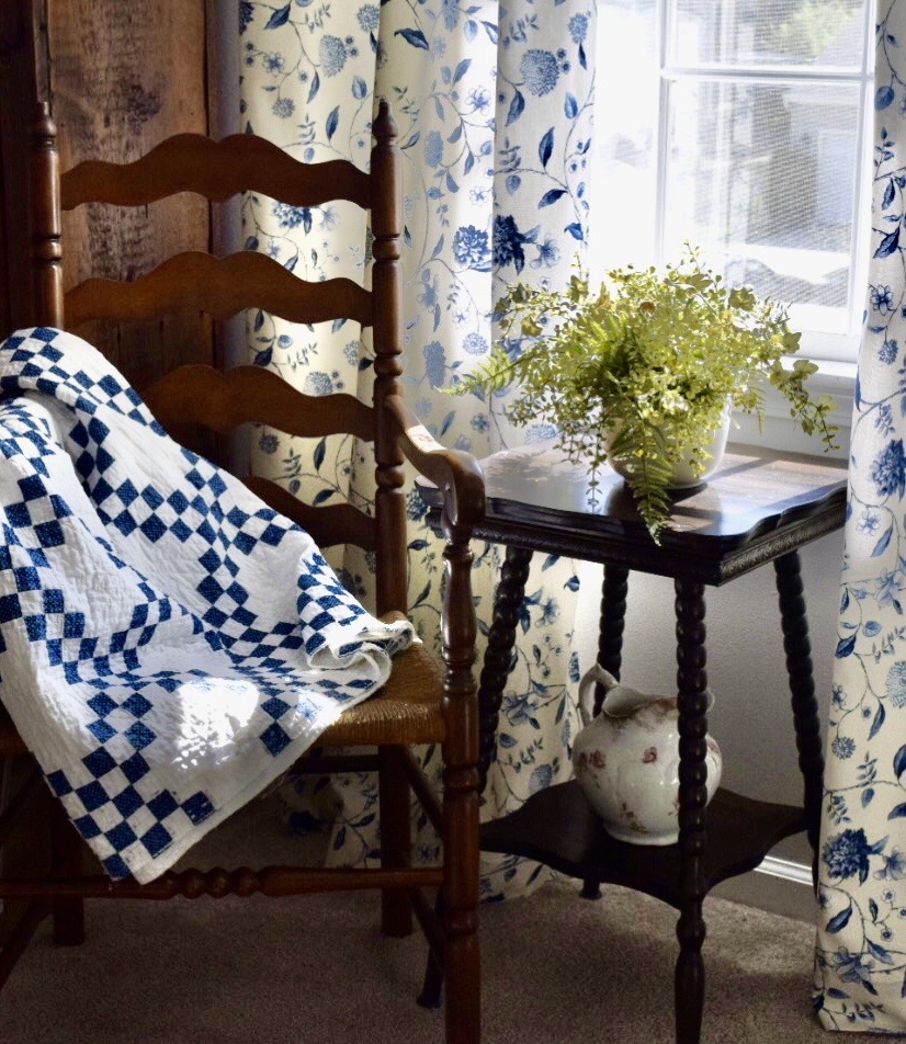
Blue and white fabric worked into the collection, including an old quilt, french grain sacks, and new curtains.
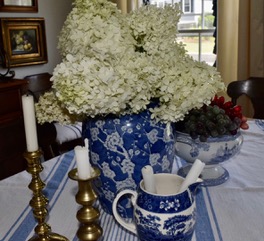
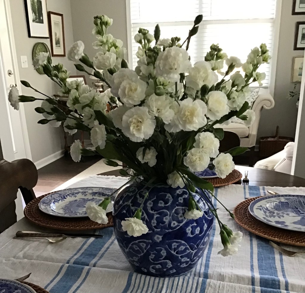
The dining table in our previous home, above, set with assorted pieces and a blue and white cloth. I use the same cloth with blue and white dishes here, below.
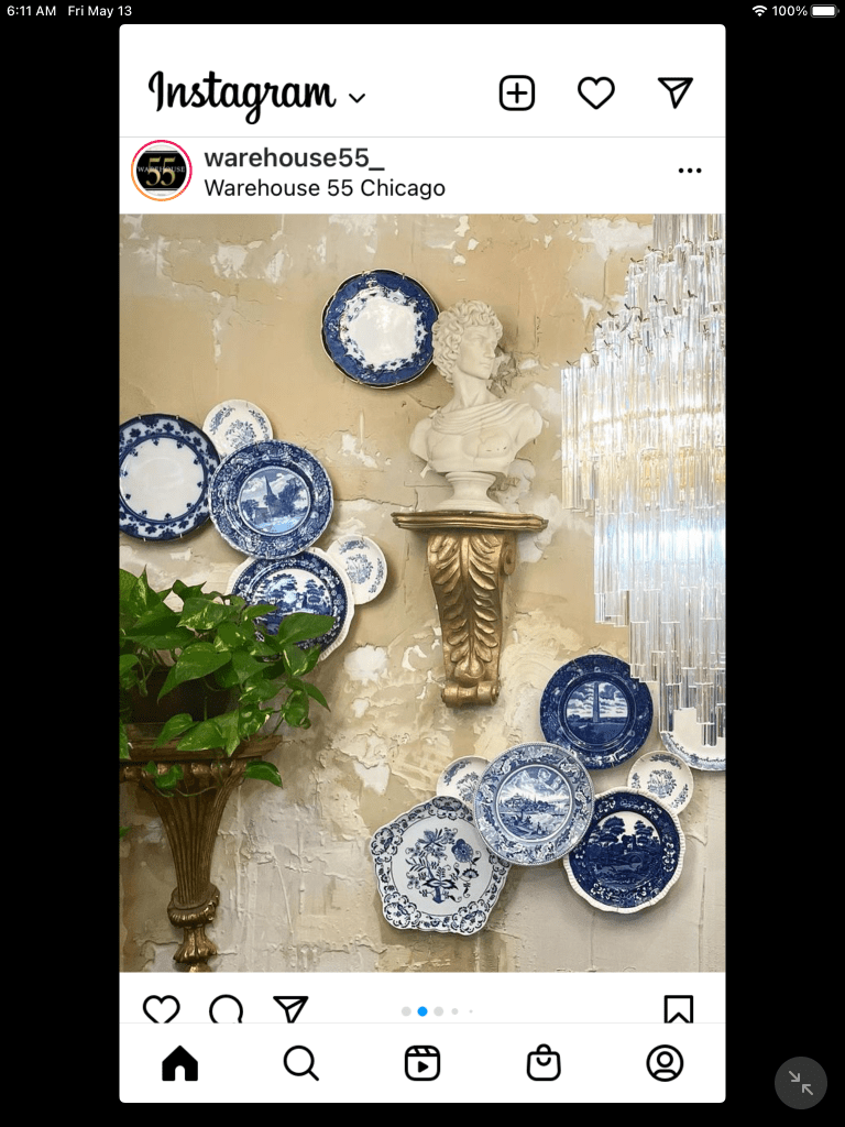
I continue to save blue and white ideas. From Instagram…

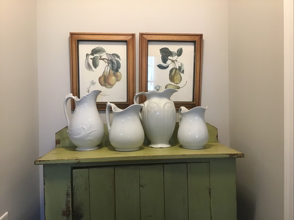
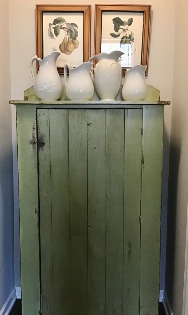
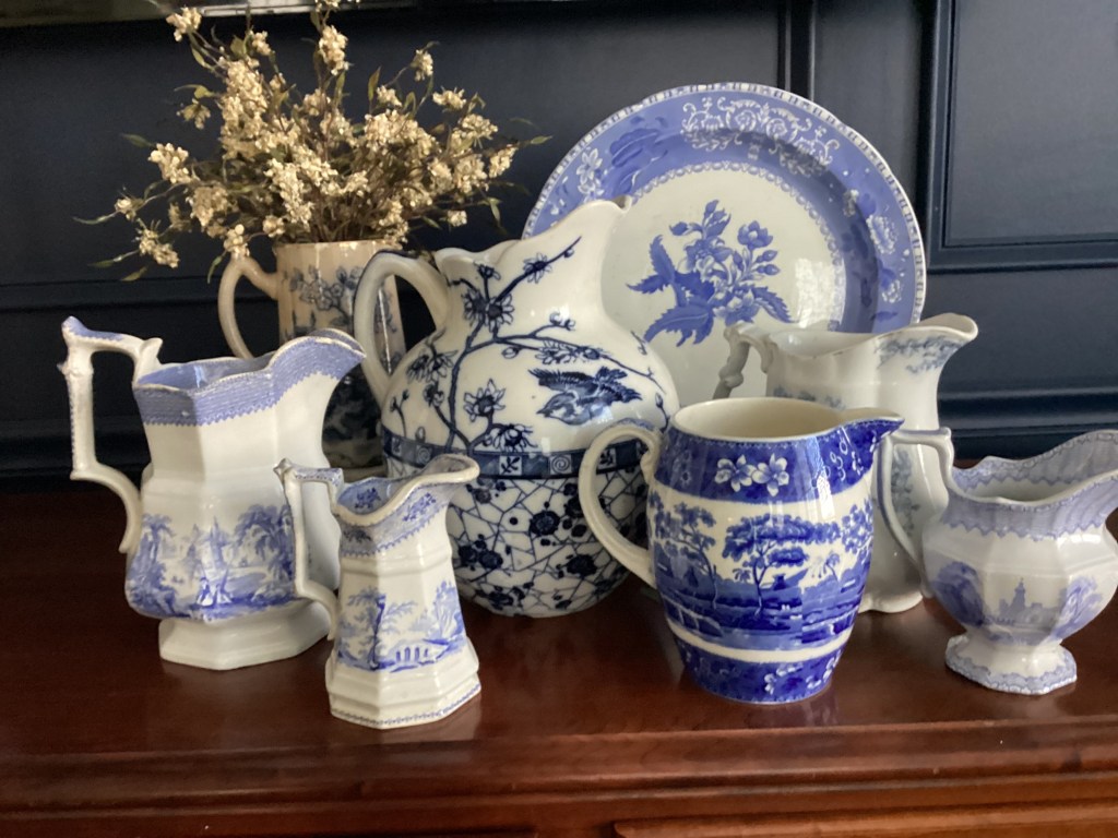
I love this collection of blue and white pitchers so much, I decided to collect all of mine together and see how they compared. What do you think?.
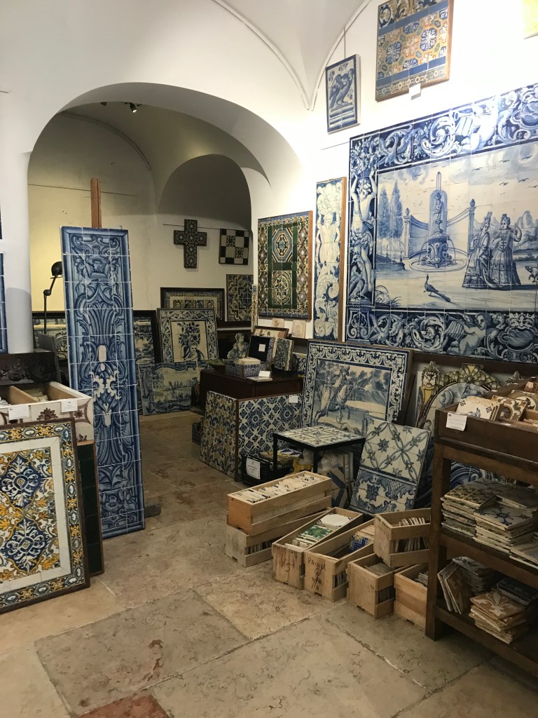
When we moved, I culled a lot from my white ironstone collection, but nothing from the blue and white. I’ll keep collecting, though old pieces — which I prefer these days — seem harder to find. On the other hand, when we were in Portugal last year, I did get caught up in the tiles.
Building a collection takes a special kind of gene. You have to be patient, you have to refine your choices or it’s just so much stuff. I have a small collection of hand-crafted roosters. It began with a handsome pair of ceramic roosters from my mother. Then I found one made from a gourd and my husband gave me a hand-carved fellow he found in California. Along the way I picked up some antique poultry prints from vintage catalogues and books.. Everything in the collection had history and/or provenance. But then well-meaning friends started adding to it — rooster dish towels and cake plates and teacups. Pieces without the same one-of-a-kind design didn’t’t belong with the pieces I had assembled, and, in fact, they kind of “watered down” what I had so enjoyed collecting. I kept those things for a year or two, but I eventually thinned them from the pack. For the most part, I think collections should be left to the collector. While I loved that people thought enough of me to want to add to a collection,
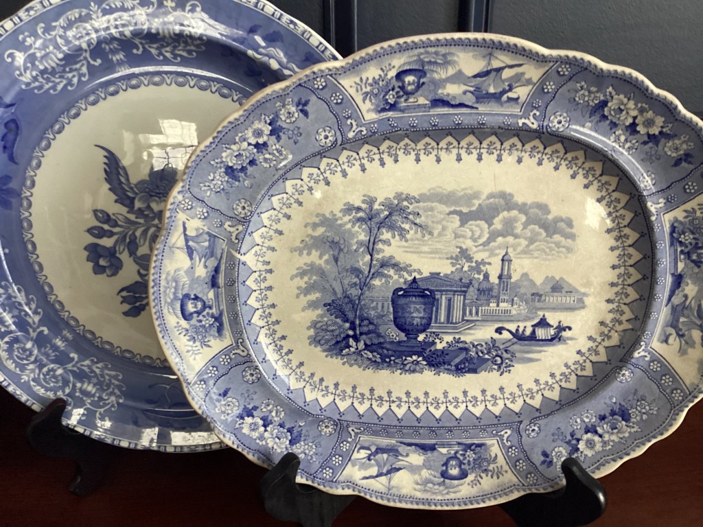
Speaking of collections, here’s my latest blue and white find, an oval platter marked “Stoke-on-Trent.” The color is especially vivid and the pattern is exceptionally crisp. Plus, I love the scall0ped border. (And this is the potential for collecting — it makes you pickier and pickier!)
Once a collector, always a collector! What is it you collect?
Thank you for stopping by. See you again soon?