One book, two pillows, and 500 postcards

I’m really hooked on watercolors. Lately I’’ve filled my sketchbook with dahlias.

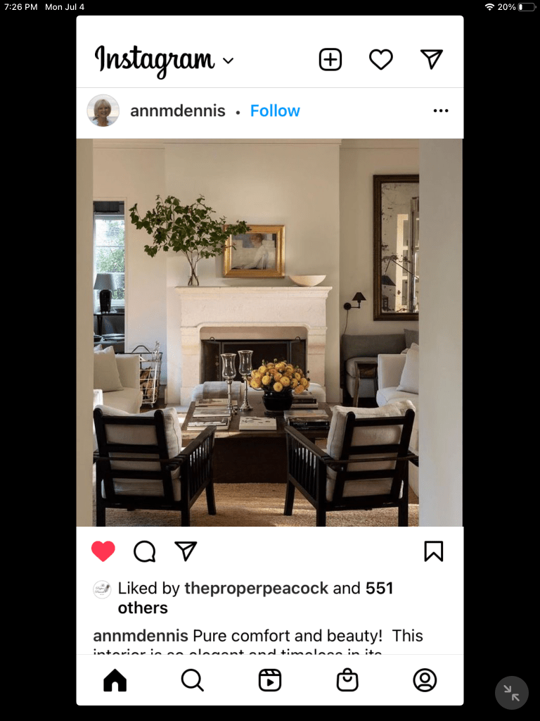
Life is such a funny ying and yang.. We have had crews here working on a plumbing issue discovered earlier this summer. The fix was quick but complicated, and so we are now waiting on new flooring in the guest room while that furniture is on sabbatical in the garage. It could be worse. On the plus side, a good friend from my working days will be in town this weekend, and I am really looking forward to catching-up over dinner.

When I wrote about my summer reading here, I totally blew past one of the best reads of the season: Doris Kearns Goodwin’s  An Unfinished Love Story, A Personal History of the 1960s. Goodwin is an historian whose dogged research and deft voice bring history to life for her readers. She won a Pulitzer Prize for Unfinished Love Story, as she did for No Ordinary Time: Franklin and Eleanor Roosevelt: The Homefront in World War II (another favorite of mine). Her other books including Team of Rivals (Abraham Lincoln) and The Bully Pulpit (Teddy Roosevelt) have been equally honored. 

But let me tell you just a little about this book. Goodwin was married to Richard “Dick” Goodwin for forty-two years. About a decade older than Doris, Dick was one of the “bright  young men” that helped get Jack Kennedy elected president in 1960. He named and helped design LBJ’s Great Society and was a speechwriter and close adviser to Robert F. Kennedy. Doris was a White Housed Fellow during the Johnson administration and worked directly for LBJ. Both Dick and Doris lived and worked behind the scenes at the seat of power during some of our country’s most turbulent times, including the Civil Rights movement and the  Vietnam War. The book is part memoir, part biography and part history based on the more than 300 boxes of papers, memos, notes, diaries, and memorabilia Dick had saved over more than five decades of his career. It lends remarkable insight into many memorable public times. This is a wonderful, “inside” look at the events that unfolded and shaped my high school, college, and early adult years. And maybe those of many of you? If you like history, especially an insider’s view, you will enjoy this read.

What was I thinking?

Here’s one of the pillows. See how greets it looks with the navy wall?

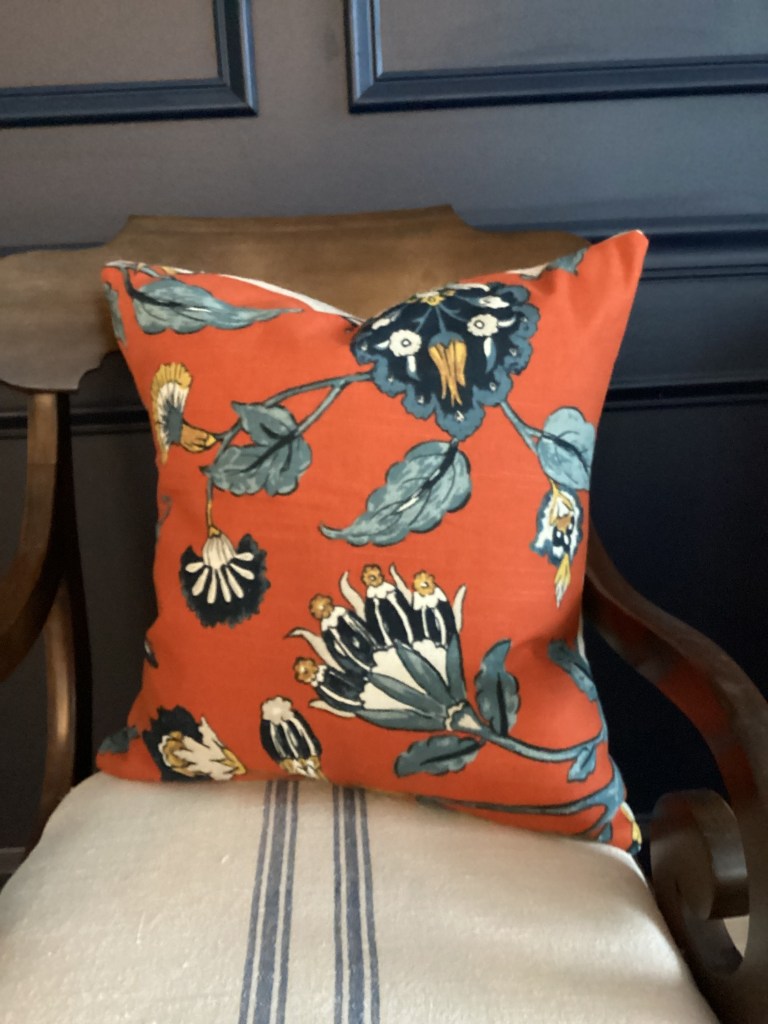
Orange is not my favorite color. Not for my house, not for my wardrobe. It feels dated to me, too reminiscent of my mother’s late sixties rust-colored sofa. So, the question is why on earth did I buy these pillows? A few weeks ago, I joined some neighbors in a shopping expedition in search of fall decorative merchandise. I’m not at all sure what I was thinking when I snatched up these very orange pillows. Yes, they are seasonal, which us what I wanted, and, yes, they have that navy print which looks fabulous against the navy accent wall in our great room. ( And truth to tell, I can spot a good navy from 50-feet.)  But they are very orange.

I imagined them on a pair of chairs in the great room, and my neighbor enthusiastically agreed.  What I was not thinking  is that the rug in that room is a very traditional red and navy Turkish design. Trust me when I say red is by far the dominant color .To be fair, there is some green and gold. No orange. 

So then I began thinking about what orange I do have in the house and guess what? There is none, unless you count this blue and white transfer ware plate with some orange flowers, a photo my daughter took in my old garden, and this rooster. That’a it. I have moved the pillows to the sunroom, which is pretty beige. The orange is a nice pop of fall color. And after Halloween I’ll put them away until next fall.  

500 Post cards

This is what 500 postcards look like.

You may recall that I wrote as few posts back about the postcard project, contacting individual registered voters with a personalized, handwritten postcard encouraging them to vote in the coming election. The project provides the  brief, non-partisan message, the postcards, and address lists. “Writers” complete and address the postcards, then mail them on a specific day in mid October. The project does not endorse specific candidates or a party, but it is sponsored by the Progressive Turnout Project whose mission is to rally Democrats to vote. Statistically, the project knows this personal contact significantly improves voter turnout. 

Like a lot of people, I felt helpless this year in the midst of a messy campaign and an election that could completely alter our lives. In fact all of this would give me a monumental headache if I did not feel as though I at least did something. So, I volunteered to write and mail 500 postcards. I finally finished writing & stamping them last week,; and they’ve been mailed on schedule. Whew!

Wishing you plenty of chocolate in this Halloween month and pumpkins in your choice of color. Thanks for stopping by. I hope to see you again soon.

Not the A-list, but the P-list

P is alsoc for purple; I seem to have lots of purple flowers sright now.

How are you? I know it’s been awhile. How’s your summer? Mine is going way too fast. I thought it was time I filled you in on at least some of what’s happening here. 

Years ago Steve and I had neighbors who were always in search of the “A-List.” You know, the one with people who supposedly had more money/power/status. Until they found it, however, they were content to travel along life’s path with the rest of us. I suppose we should have been insulted by this attitude, but they were so blatant they were funny. (And we weren’t the only ones thinking that.) Not surprisingly, the relationship quietly drifted apart. Maybe thy found the A-List? However, the A-List remains a running joke in our household. 

This post has nothing to do with money, power or status, but it is a dump of what I’ve been up to this season and it turns out that it all starts with the letter P. .

First there is the patio

The whole patio is not ready for prime-time, but here’s a slice.

The patio the builder attached to this house was a small cement rectangle that barely held a round dining table and four chairs along with a grill. In fact, if you chose the wrong chair you were the lucky one able to reach out from your seat and flip the burgers. So, a few weeks ago we had that slab removed and a new, much larger one poured to replace it. I am not a fan of cement slabs, but in our really little yard (we have the smallest lot in the subdivision), it seems to ground the landscape and offer some good possibilities for additional landscaping. 

Just to complicate things, our design/decision-making was somewhat delayed by the fact that the house behind us, which actually sits perpendicular to ours, is on a lot that was graded a few feet higher than ours and those of the neighbors on each side. This was probably the fault of the initial developer, but thankfully the new owner in that house — not wanting his lawn, etc., to wash into ours or the neighbors’ — put his foot down with the builder. After weeks of work and readjustments to drains and irrigation, a landscaping company has installed a low, very attractive stone retaining wall. Win, win for all concerned. It looks soooo good.

Meanwhile, Steve and I, along with some extra muscle from our son, softened the cement block look of the patio with some dwarf hydrangeas and perennials. There is more landscaping to come along “the wall” and outside the sunroom, but not until we are out of the worst of this heat. In the meantime, we’re excited to move forward with this and have been having coffee  on the patio most mornings! If there is anything we have missed from our Wheaton home, it’s the mature landscaping, but starting from scratch is an interesting challenge. 

Painting

This is pretty rough. I’d like to think my technique has improved since I painted it, but it is one of my favorite efforts, largely because it’s my own composition as opposed to a painting from a tutorial or class.

I happily admit that I am now totally obsessed with my watercolor efforts. I’m watching YouTube videos, reading, and now trying to do sone sketching or painting every day. And, of course, my class continues to meet. It’s interesting to sample the different watercolor styles of my classmates along with the artists I’ve discovered on YouTube.

I’ve acquired a very cool pocket-sized set of paints to use when painting away from home as well as a small sketch pad to carry with me. Plein air painting is a joy. There is something about being surrounded by Nature that feeds whatever artistic inspiration one has. My goal is to draw or paint a bit each day. But that’s easier said than done, and some days the results are very satisfying, some not so much. I find I look at artwork, scenery, a vase of flowers, or even a vignette of books and candles on a tabletop or shelf differently. 

Postcards

During the last election cycle in 2022 I joined my daughter and daughter-in—law in the postcard project to contact individual registered voters and encourage them to vote in the coming election. Basically we hand write a short, non-partisan “get out the voter” message provided by the project on postcards also provided by the project, address them to individuals from the registration lists provided, and mail the postcards on a specific day in late October. The project does not endorse specific candidates or a party, although it is sponsored by the Progressive Turnout Project whose mission is to rally Democrats to vote. Statistically, the project knows this personal contact significantly improves voter turnout. 

I’m not comfortable ringing doorbells or making phone calls for a specific candidate, but like many people I feel helpless in in the midst of a messy campaign and an election that could completely alter our lives. In fact all of this would give me a monumental headache if I did not feel as though I am at least doing something. If you are interested in learning more about this grassroots project, visit the website, www.turnoutpac.org. 

I hope you are cool, dry, and enjoying the sweetness of summer. Thank you for stopping by. 

Something fun for spring

Okay, you may not consider it fun, but I do. Today’s post celebrates my girlish passion for a new box of crayons, my half-hearted sidesteps into art, and my recent discovery of painting with watercolors. 

After months of cajoling, a neighbor — who also happens to be a watercolor artist and teacher — agreed to offer a class to some of us wanting to flex our artistic muscle. And now I’m hooked. Watercolors are not easy and there is a lot of technique to learn (the most basic being how do you make the water and the paint work together?), but I’ve found it to be a welcome challenge, a good test for my latent creative muscles, and, therefore, a bit addictive. 

I have always loved the idea of drawing and coloring. A new box of crayons could set this girl off on artistic adventures for days. When I was in junior high and high school, my dad was an avid photographer. He recognized my artistic bent and bought me the paints and brushes to hand color some photos. We were just getting really good when color photography crept in and stole our thunder!

In college I was able to take a few studio art classes in drawing, painting and printmaking for half credit (therefore requiring much less work) and scratch my creative itch. I loved it! Studio classes were a nice break from books and the library, and I discovered some like-minded friends in the process. We were not “arty” like the art majors (a terrible generalization I’m sure), but in retrospect I think we were engaging in a bit of art therapy at a challenging time in our lives. 

In the intervening years, my writing profession — pages and pages of ad copy, newsletter and magazine copy and the accompanying layout sometimes required made it hard to separate the art from the words. I was picky, picky, picky about color, type face, and photos, what worked and what did not, all of which probably made me a difficult co-worker from time to time. Meanwhile, away from work, my personal passion for decorating and collecting grew. You can see how I fed that artsy muscle. 

Fast-forward to the present, where watercolors have become an increasingly popular hobby. It turns out several of us were eager to try; we just needed a teacher. And now, some of us are really hooked. I’m not at all good, I paint too fast, I don’t always use the water to great effect, and I’m just beginning to appreciate the value of mixing colors from red, blue and yellow instead of being seduced by the other colors in the paint box. Right now I’m practicing small “studies” like individual flowers to learn and practice techniques and explore the use of paint and water together. The exploration is at once engaging and — as you can see — primitive. 

One of the most interesting aspects of this process is how differently we each approach the same lesson and paint the same flower. Talk about the “eye of the beholder.” I’ve also begun to mentally consider other subjects to paint. In class we have focused on simple floral forms, but what about fruit or vegetables or greenery? My imagination runs wild…

It’s fun at this stage in life to embrace a new challenge, to look forward to carving out time to paint, to make new friends who share your new interest. I’ve even carved out some “studio space” in our loft. (Which is really just my way off spreading out in safer space than the kitchen island!)

What’s on your creative challenge “wish list” ? Let’s talk about the risks and rewards of tackling something new.

Thank you so much for stopping by and reading along with me. See you again soon!

It begins with a trip to the museum…

Rapgaello Sanzio

Last week we took a cultural field trip, visiting the Columbus Museum of Art to view the Dresden Tapestries, based on cartoons by Raphael in 1515-16 and commissioned by Pope Leo X to hang in the Vatican’s Sistine Chapel. Although we had seen tapestries in French chateaux and other European museums, this was our first opportunity to get a little closer and to learn more about how they are made. The bottom line: they are really art times two, the artist’s initial cartoon and the fiber art of the tapestry produced from it.

What is a tapestry?

The more intimate setting of the Columbus museum and the quiet weekday timing offered a perfect opportunity to view the tapestries more closely. A docent gave the group we were with a basic overview of tapestry weaving as well as the history of these particular pieces. Tapestries are a unique fabric art, woven to portray a scene, story or event, often biblical or historic. These tapestries focus on the ministries of Saints Peter and Paul. But more about that later. 

This is the cartoon by Raphael for the tapestry “Christ’s Charge to Peter.” This is just one in a series of ten cartoons.

In essence the tapestry subject is a woven copy of a drawing (known as a cartoon) created by an artist. Tapestries are painstakingly handwoven — most often by European workshops specializing in this art form — with the design on one side of the fabric. To do this, the cartoon is copied (by hand!) and the copy laid face-down on the fabric. The finished tapestry becomes a complete reverse of the original cartoon. The cartoons for the original set of these tapestries were sent to Brussels to be woven in the workshop of Pier van Aelst. They were probably completed in 1520.

About the Raphael tapestries

My knowledge of Raphael was pretty sketchy, so after the museum visit I delved a little more into his life and his role in the Renaissance art world (Of course, it would have been even better if I’d done this homework first!). Along with Michelangelo and Leonardo da Vinci, Raphael is considered one of the three architects of the High Renaissance, a period from as early as 1495 to as late as 1530 of exceptional artistic accomplishment in Rome and Florence, Italy.

Artistic temperaments played a part in Renaissance art. Historians point out that Michelangelo was no fan of Raphael and openly critical of his work. Raphael was generally thought to be more agreeable and charming, traits that may have played a part in his success in acquiring significant commissions. In developing the cartoons for this series of tapestries, Raphael was very aware that they would be in close proximity to Michelangelo’s famous ceiling in the Sistine Chapel; however, the subject matter — Christ turning over the church to Peter and Paul — was different.

Like many artists, Raphael got an early start; his father was a court painter and Raphael was apprenticed at a young age to another master. After time spent elsewhere in Italy, he found his way first to Florence and eventually to Rome. His reputation firmly established, one biographer noted that Raphael had a workshop of fifty pupils and assistants, many of whom later became significant artists in their own right. This was arguably the largest workshop team under any single master painter. The workshop included masters from other parts of Italy, probably working with their own teams as sub-contractors, as well as pupils and journeymen. There is little evidence of the internal working arrangements of the workshop, but this was the artistic custom of that time. Raphael died quite young (at age 37 in 1520). He is perhaps best known for the frescoed Raphael Rooms in the Sistine Chapel. The series of 10 cartoons for tapestries representing the lives of Saint Peter and Saint Paul was commissioned by Pope Leo X in about 1516. 

“The Miraculous Draught of Fishes.” Like all the tapestries in this series, the subjects refer to Christ turning the church h over to Peter and Paul.

The Dresden tapestries are one of numerous sets woven from these cartoons after Raphael’s death. Seven of Raphael’s original 10 cartoons for the series have survived and are now in the Victoria and Albert Museum in London. The tapestries woven for the Vatican no longer hang in the Sistine Chapel but are displayed on a rotating basis in the Vatican Museum. They returned briefly to the Sistine Chapel in 2020 in honor of the 500th anniversary of the artist’s death.

This is the cartoon for the tapestry above. Note the images are reversed.

The impact of the tapestries and Raphael in the art world is evident in the second part of the exhibition, which includes drawings by Raphael that were studies for his cartoons. Numerous other works—paintings, prints, drawings, and sculpture—were created by artists influenced by Raphael’s designs. The artist’s style and in some cases entire images were lifted from the much larger tapestries to become art on their own or to be worked into other pieces. Noted renaissance and baroque masters such as Rubens and Poussin are among the artists who incorporated Raphael’s work into their own.

The Columbus exhibit is comprised of six works from the duplicates ordered by the Prince of Wales (later King Charles I) about 100 years after Raphael’s death. (Here’s where the world history kicks in.) They were produced by tapestry makers in Mortlake, England. Augustus the Strong, elector of Saxony and king of Poland, brought the tapestries to Dresden, Germany in the 18th century. The tapestries were restored in the late 20th and early 21st century. The Columbus exhibition is the first time they have been displayed outside Europe. 

Two lessons in one

I think I always looked at tapestries as works of art, but certainly without appreciating the entire process. First, the artist creating the cartoon has to plan the scene, starting with a series of rough sketches that are refined into final drawings to be included in the cartoon. These are huge works with significant detail and background scenery. This is where the other artists in the master’s workshop came into their own, copying the master artist’s style and intent. This is the first art lesson. The artistry of the tapestry weavers is the second lesson. Perhaps time for more research?

I don’t know about you, but I love when a “field trip” of some sort sets me off on subsequent pursuits. I’d like to know more about the lives of Raphael and Michelangelo. Can you imagine these men elbowing their way for favor among the papal and royal interests of their day? I know Francis I lured Leonardo da Vinci to his chateau in Amboise, France, where da Vinci (and the Mona Lisa) remained until his death. What story lines would you pursue?

Thank you so much for stopping by for my impromptu art history class. See you again soon!

Getting the hang of picture-hanging

Recently, I put my heart in my back pocket and went ahead and made nail holes in our “virgin” walls. I’m not an empty walls kind of girl, and we had pictures, prints, etc., stacked up in corners everywhere. The real issue was less about making holes in new walls and more about deciding what should hang where.

First we decided what we definitely wanted to hang again, what we thought we would hang again, and what we never wanted to see again. (This last category took some negotiation and that process continues.)

About those holes in the wall

I never have a problem hammering a nail or picture hanger into the wall. Sometimes, of course, despite careful measuring, the picture is not hung in the exact spot you planned or maybe it is but doesn’t look right after all. In that case I just move it. Does this sound cavalier? My husband will roll his eyes at this, but I don’t worry much about excess holes in the wall.  A dab of spackle, a quick sand and a light brush of paint take care of most errors. I admit that there have been times when the holes were not visible from minor hanging adjustments until we took all the artwork down to repaint the room and revealed what can only be described as a machine gun look to the walls. In my mind that just means more spackle before you paint. However, I understand that for some, this can be tragic.

Tackling new, blank walls

Sometimes there’s a natural anchor for artwork, like a fireplace or a piece of furniture. This is the bottom of the large buffet from my former dining room. When we moved here, I left the metal shelves off the top and settled it on the biggest wall in the foyer. These prints of Siena and Montapulciano hung in our former living room over a marble-topped dresser, but they seemed perfect for this space. I think, however, I need to switch to a larger lamp and perhaps extend the wall arrangement beyond the width of the cabinet. Does this look skimpy to you?

We are both really fond of a number of prints we bought on our European travels. They are grouped together on a slim wall space, also in the foyer. I started with the large print on the left, then the two from France stacked on the right. Then I just filled in the space. They all came from open air markets or tiny galleries and I don’t think any of them cost more than $20. I thought about just hanging the two square prints from France, but since this is across the hall from the arrangement above, it seemed appropriate to add more weight here for balance.

When I was arranging these groupings, (left and below) I started on the floor first. I discovered that a basic drop cloth was about the same color as our walls and it offered a neutral background for arranging the prints. So, I laid the pieces out, adding, subtracting and arranging space until it seemed right. Sometimes I had to walk away for a while and come back to it.

It’s interesting to mix the media in a group. We did that in the library with this combination of black and white photos, a black & white print and some smaller, sepia-tone prints. This is a grouping that I imagine may grow a bit, as we find additional pieces, though I would like to stick to black and white.

It’s fun to hang something in a more surprising spot, like over a door. This old fruit print is from my pears/plums/grapes period, when I was collecting artwork and plates with that motif. (It’s a long story.) I’ve passed on most of those pieces, but I do love this print and its unfortunately heavy, dark oak frame.

More hanging tips and tricks

  • There’s a hanging system for everything, from heavy-duty french cleats (which we used to hang some antique shutters in our last house) to super light tacks for small pieces. Cruise the aisle with these supplies at the hardware store and ask questions. Then, arm yourself with a selection of anchors, hooks, hangers and even Command stick-on strips. I keep my supplies together in a kit with a small hammer and a tape measure so I have what I need when I’m ready to hang.
  • Framing gets very expensive very quickly. Usually what we find on our travels or at antique markets is unframed. I have most things framed at Michael’s or Hobby Lobby, and I wait for a sale or a coupon. Their frame selection is substantial, and I have never been disappointed in their workmanship.
  • You probably already know this, but in general, the center of a single picture should be between 56- and 60-inches from the floor. If you’re hanging a gallery of pictures, you will have to adjust this, but keep in mind that wall arrangements should be essentially at eye level, not floating above furniture.

The snake-bit system

A designer friend introduced me to this a few years ago. It requires two holes for every frame (Ouch!), but once hung nothing moves. This is especially useful in a hallway or high-traffic area where pictures often are knocked askew. To do this you need a hammer, small finishing nails, wirecutters, a small level, a small block of wood, a tape measure and pencil. 

  • Determine where you want the picture to be. I like to make a small pencil mark on the wall at the top corners of the frame and in from the left and right sides of the frame a quarter- to a half-inch, depending on the width of the frame.
  • On the back of the frame, make comparable marks a quarter to a half-inch on the left and right sides and 1-1/2 to 2-1/2 inches down from the top of the frame. Tap a finishing nail into the frame at each of the two marks. The nails should be at an angle, like fangs on a snake. Make sure the nails are anchored firmly in the picture frame. Use the wirecutters to snip off the heads of the nails. You need to be able to drive this end into the wall.Measure the distance from the top and sides of the frame to the point where the nail is in the frame. Using the lightest touch of a pencil, transfer this to the wall, using those first marks you made indicating the left and right top of the frame.
  • Using another finishing nail, make a “starter hole” in the wall for the snake bit nails to slide into. Tap this nail in part way and angled down to match the nails on the frame. Pull the nail out and you have holes for your snakebit nails to slide into. Now carefully fit the snakebit nails in the frame into the holes in the wall.
  • Gently push the frame down to snug it to the wall. If you need the hammer to tap it in place, use the small block of wood between the hammer and the frame to prevent damage. Use a 6- or 8-inch level to check that the top of the frame is level.

Until you have done this a few times, it seems like a huge project. Don’t be discouraged if your holes are too big or unevenly spaced. Don’t be surprised if you end up with a few extra holes until you perfect this technique. We used it on these botanicals in our last house, and none of the prints dared to move. 

None of these ideas are original. In fact, the concept of assembling wall art by subject matter or color is fairly “tried and true.” It works. Most of my ideas come from a Pinterest board I’ve saved called “Walls,” because it includes shelves, sconces, baskets, plates and more. Like I said earlier, there’s a way to hang almost anything on a wall. And the mix of items is so much fun!

Obviously, there are more walls to deck, more pieces to find places for, and inevitably more to collect, so stay tuned. For now I’m giving my hammer and hangers a rest and enjoying what we’ve accomplished.

Thank you so much for stopping by. See you again soon.

Summer without a garden & more

Normally at this time of year I would be including lots of notes about my garden, but I don’t have one yet in Ohio.

Good morning! First, thank you for your supportive comments on my last post. I really appreciate them. After my rant, however, I thought something a little lighter may be in order, so I’m sharing my latest Instagram favorites. They are probably as good a clue as any to what’s on my mind, what I’m finding inspiring, and what I may (or may not) be planning to do.

My summer without a garden

Our yard is still clay and rocks; there is also a healthy crop of weeds. (It’s really pretty awful looking.) The builder is awaiting the appropriate parts and crews to finish drainage and irrigation issues. In the meantime my green thumb can only dream. So here’s what I’m thinking.

We will have a small garden out front based on some bushes that the landscaper provides. We will supplement that with some blooming plants and I would like to try for a green and white garden. It’s a small area and I want like it to look cohesive. Something like this, with Lambs Ears and Hostas for texture and color variation, along with white blooms, below.

In the back yard, we have a small patio, sort of a very mini version of this, below. Again, I like the blue, white and purple with the greenery. And I love the idea of a few really generous pots for color, but still keeping a tight palette.

Hung up on picture hanging

We continue to work on getting pictures hung here; Steve and I both think they add the personal touch that makes a space feel like ours. However, the spaces here are somewhat different so I’ve been searching for inspiration on Instagram.

We have several pairs and even trios of prints to find places for. I am not necessarily a symmetrical person, so arrangements like this, below, that work for multiples often throw me off. But, hey, if James Farmer can do it, I can too! I love the way he takes the edge off the symmetry by staggering heights and objects on top of the cabinet (which would be perfect in my house.)

I really like the idea of dressing up a bathroom or powder room with artwork. The image below does just that and is the kind of loose arrangement I usually prefer in most rooms, instead of something too studied. (Although I think it’s harder to achieve.) And I like the way the classic frames and touches of black and white give this space more sophistication.

I’m planning a picture-hanging post soon to show off some of what I’ve done so far. And some of what I’ve already moved!

Some rooms call my name

If you are one of the legions of fans of Nancy Meyers films (The Intern, Something’s Got to Give, It’s Complicated) do you like the films or are you just mesmerized by the gorgeous settings? I’ve seen each of these movies more than once, and they’re charming. But I love her sets. They are the ultimate eye-candy. So it’s no surprise that the blog world was set a-buzz when the newly renovated interior of Nancy Meyers’ own home was revealed in the current issue of Architectural Digest. You can go directly to the magazine, but if you’re really interested I encourage you to read Joni Webb’s post (here) to get a look at Nancy’s house then and now as well as all her sets. No one covers a decorating story like Joni Webb.

This is the perfect living room in Nancy Meyers’ house, below. It’s a little traditional, somewhat spare in a modern sense, not overly staged but certainly welcoming. I like the way the mirror off to the right (instead of staged over the fireplace() reflects more of the room, the substantial coffee table with plenty of room for drinks, snacks and magazines. I could easily sink into one of those chairs to enjoy a conversation with friends or a drink in front of the fire.

Sometimes I scroll along in IG, pause, scroll some more, go back and like something and scroll some more. Then I finally go back and save the photo. That was the case here. First, I’m a sucker for a center table like this and when it’s skirted, it’s even better. (Any excuse to incorporate a generous swath of fabric and trim!) I like the way the white in this room balances the wood. Those beams could be imposing, but they aren’t. And that table — perfect centered with big flowers and staged with a collection of books and memorabilia, at least that’s what I imagine.

Paris is always a good idea

We are beginning to think about travel again. It turns out I’m willing to go anywhere as long as it ends with a few days in Paris. And even if I don’t get to Paris, I still save images of the city. Cafe de le Nemours is one of our favorite stops there. It’s near the Louvre, next to the Comedie Franchise, and around the corner from the Palais Royale (also good for a glass of wine) and therefore perfect for people watching. It also serves a wonderful quiche that’s perfect any time of day if you need more than a cafe or wine.

And after, you can walk over to the Louvre and, if you have had the foresight to buy the right kind of ticket, enter thru a side door for a quiet look around. Just avoid all signs leading to the Mona Lisa.

Of course, Paris is going to be a bit of a stretch if we decide to road-trip thru Canada or head to Sonoma for some wine tasting! I think the real issue here is indecision. I’m not packing any bags just yet!

In the meantime, I hope you’re having a great day. Thanks for stopping by! See you again soon.

A day at the (art) museum

BisaDetailHi. Before I say another word, I need to apologize for my last post. “Good Stuff” probably arrived in your inbox riddled with typos and crazy mixed up type. I can’t believe this happened, but I hit publish instead of review. And out it went. I’m so embarrassed. I realized my mistake immediately, but it was too late. I did clean up the mess on my website, so if you read the post at ivyandironstone.com, you saw the corrected version. 

On with today’s post. I’m so excited to share this. 

Earlier this week I met two of my best-ever friends (the kind from the first day of high school!) downtown at Chicago’s Art Institute. Our goal was to see the Obama presidential portraits and then hopefully take in another exhibit on quilts. It turned out to be quite a day. 

The Obama portraits were more interesting in person that we expected. Like us, you have probably already seen them in the media. They are not typical presidential portraits. The artists — Kehinde Wiley for former President Barrack Obama and Amy Sherald for former First Lady Michele Obama — are the first African Americans commissioned by the National Portrait Gallery to create official portraits of a president or first lady.  

Mr. Obama’s pose was familiar — seated, leaning forward with his elbows on his knees, as if he’s ready to engage with the viewer. The portrait is really large, commanding even, and maybe a little imposing. I’ve been curious about the leafy background since the painting was revealed. The artist used it to work in flowers representative of places in the president’s life, including Chicago, Hawaii, and his father’s native Africa.

IMG_2361

Mrs. Obama’s portrait is also non-traditional. I imagine most viewers are initially struck by her gray skin, a trademark of the artist. According to the Art Institute, Sherald  does this “as a nod to these historical photographs and a reminder of the relative absence of African Americans in the history of painted portraits, but also to relieve her subjects from the internal and external limits imposed by the construct of race.” Interesting, huh? The hair, the expression, and the African-inspired fabric of her dress are all very much Michelle Obama. And purposeful. Interestingly, the background on her portrait is just blue. The blank but colorful background is another hallmark of artist Sherald.

IMG_2363

Chicago was just the first stop for these portraits.  They’re traveling on to the Brooklyn Museum, Los Angeles County Museum of Art, High Museum of Art, and the Museum of Fine Arts, Houston.

Bisa Butler’s portrait quilts

I’m not sure what we expected from this exhibit, but it wasn’t close to as extraordinary as these quilts proved to be. Artist Bisa Butler constructs her quilt portraits from bits and pieces of fabric, from the finest details of a facial expression to the puffiest sleeve on a dress. I tried to show some of the detail in the first photo, above. 

Although each work is strictly fabric, she approaches each piece as she would a painting, often working from a found photograph and selecting fabrics as an artist selects paint pigments. Butler incorporates kente cloth and wax-printed African fabrics in her quilts, using bright jewel tones rather than more traditional shades to depict skin tones. She believes this conveys the emotions of her subjects —who may be everyday people or historical figures. Look at the range of expression on the faces of the children in this quilt, Safety Patrol, which opened the exhibit (and knocked our socks off from the start.). 

IMG_2366

This quilt is based on an old photograph. The tulle on the hats is a three-dimensional addition. I love how naturally the women are posed.

IMG_2372

We were struck by the detail on the mother’s dress. Once again, the pose is so natural. Look st Dad, holding his daughter still

IMG_2370

I love the fabric layering and detail in each quilt and the remarkably life-like poses. (Look at the feet in each quilt!) I have always considered quilting as a precious part of our American heritage: a necessity for frugal homemakers to use what they had and an evolving craft reflecting historical moments as well as an art form. Bisa Butler’s work redefines the medium.  I’ve spent a lot of time studying these images, trying to grasp both her vision as she approaches each quilt and then the skill and artistry to select and assemble the fabrics.

That’s all I have right now. I hope you are having a good week. Thanks for stopping by and I’ll see you again soon.   

Binge-ing on culture

Lately I have found myself on a bit of a culture course. And while I’m certainly not complaining, I am amused at how things sometimes come together. The last few weeks are a good example.

One of the advantages of living in a big city is the access to cultural and entertainment venues. And while that is certainly true, it’s also true that making the time, getting the tickets, and all the other requisite details often get in the way of what the city has to offer. Our suburb is twenty miles west of downtown Chicago, and while we have easy access to the city by car or commuter train, it’s more than a run to the grocery for milk.

My binge started with tickets to see The King’s Speech at Chicago Shakespeare. Perhaps you have seen the movie about Prince Albert, the Duke of York and his struggle overcoming a crippling stutter at the same time his brother, the Prince of Wales, was about to abdicate the throne, making Albert the king as Europe was going to war with Hitler. (Talk about pressure!) The play was enjoying critical acclaim at Chicago’s Shakespeare Theater. Everything I have seen there has been first-rate and this production did not disappoint, including the appearance of Harry Hadden-Paton, of The Crown and Downton Abbey, as Albert. My husband and I totally enjoyed the evening.

But then, less than a week later, I found myself at Symphony Hall. I am joining a girlfriend this season in a series of five concerts. She has been a subscriber for years, but her partner in this venture decided not to participate this season. The seats are good, and the cost when you subscribe ahead of time is do-able, so of course I said yes. Well, these seats are more than good; they’re in the fourth row. I can watch the violinists finger their instruments. We park in the garage across the street, grab a bite to eat and sit back and enjoy. I may be hooked!

But, wait, there’s more!

My usual cultural destination in the city has always been the Art Institute. (I’ve written about various visits here, including the Thorne Miniature rooms, John Singer Sargent and Gauguin in my Miscellaneous File. ) A year or so ago friends introduced us to a monthly lecture/discussion series at the AI. We are all retired, so when schedules allow we meet there to attend the series and enjoy lunch after. Last Friday was especially appealing, because a new Andy Warhol exhibit has just opened. We met early to see as much of Andy Warhol-From A to B and Back Again as possible before the regular lecture. But we may need to go back, because this is an extensive exhibit that takes the visitor well beyond Warhol’s prints of Marilyn Monroe and Jackie Kennedy.

And early pen and ink self-portrait of Warhol.

I wish I had done a little AW research before we went (Note to self: next time do a little homework.) Warhol’s much more than just a pop icon of the sixties, although that certainly describes much of his work. Unlike other artists, Warhol began his career doing commercial art. His first commission was drawing shoes for Glamour magazine in the 1950s, followed by work as a shoe designer for manufacturer Israel Miller.

Much of Warhol’s later work continued to be based on commercial art, like the Campbell’s soup cans and the Brillo boxes. He was well known for his silk screen process. Many of those pieces, including the famous and familiar Marilyn Monroe image, were based on commercial photos that he copied and successfully turned into iconic images using a silk screen process. (The Marilyn Monroe image was originally a studio publicity shot for her last movie.) The silk-screened portraits, in fact, became so popular that movie stars, public and private figures came to Warhol for what he referred to as “commercial business.”

In addition to the individual portraits, Warhol often produced multiple versions in one work, sometimes with slight variation in color and/or shading.

This oversized portrait of Mao Zedong (it’s about 125-feet tall) is part of The Art Institute’s permanent collection. The Institute’s archive notes that Warhol’s portrait displays some irreverence towards the image that was widely displayed in China: “Flamboyant brushstrokes compete with the photographic image, forming color splashes on Mao’s clothing. Red rouge and blue eye shadow resemble graffiti.” Some art historians view Warhol’s treatment here as commentary on similarities between Communist propaganda to capitalist advertising media.

Like so many artists, Warhol’s artistic muse went well beyond the canvas. He spent most of his later years exploring videos and movies. Warhol died at only 58, so it’s interesting to speculate on where his art would have taken him. Like many gallery-goers, I’m more drawn to Renoir and Monet than Warhol. But there is no denying the impact Warhol has had on the art world. He used techniques like silk screen and video and blurred the lines between commercial art and fine art. And that alone is saying a lot.

What about you? What kind of art are you most drawn to?

So much for my culture binge. It’s time to take a deep dive into holiday prep, a.k.a. oven cleaning. Thanks for stopping by. See you again soon?

Lately: Baseball, architecture and how my garden grows

So what do you think there are more of, leaves on the trees or blades of grass?

That was my eight-year-old grandson’s intriguing question as we drove home from one of his ballgames this weekend. Since the answer would take lots of Google-ing and probably some math, I left that to his dad and Grandpa. But I think Jack unwittingly summed up June. It’s just so green, so lush, so full of promise.

Trip #1

Speaking of grandsons and baseball, Steve and I spent the weekend in Ohio carrying our folding chairs from game to game, following the five-year-old and his T-ball team and the eight-year-old and his coach pitch team (who seem like pro’s after watching T-ball).

These games have not changed in 30 years. Players wave to parents from the field, play in the dirt, forget where they’re at to watch a low-flying plane overhead and are happily surprised when they get a solid hit or make the play at first or second base. Forget marching bands and flag-waving patriots, this is America.

Trip #2

Before heading to Ohio, I joined a friend on a “field trip” into the city to take the Chicago Architecture Foundation Center cruise along the Chicago River. If you are a history or architecture fan (and even if you are not), the “Great Chicago Fire” led to a building renaissance in Chicago. And what started after the fire in 1871, continues today.

The Chicago skyline, looking west on the river.

The river cruises are led by volunteer docents from the Foundation. I know they have a common script that follows the boat route and they are well-trained to answer questions, but I believe you could do this cruise again and again and still learn something new, because each docent puts his or her own spin on the material. Maureen and I were part of a much larger group of Chicagoans, so this could have been a challenge to the volunteer. After all, we’ve all seen these buildings before and heard the stories behind them, and we have worked/shopped/visited them. Many of us had taken the tour before. But her passion for and knowledge of Chicago history and architecture was so palpable that she kept all of us totally engaged.

Separating history from architecture from the Chicago River is virtually impossible. Fort Dearborn, Chicago’s first settlement, was along the river. The engineers who worked with the architects solved the design issues, reversed the flow of the Chicago River, built more than a dozen movable bridges over the river so the city and industry could grow north and south. They replaced cast iron with steel and glass. The building and engineering continue to evolve. It’s a great story filled by the likes of Daniel Burnham, Louis Sullivan, and Mies van der Rohe and populated by buildings as diverse as the Tribune Tower and the Willis (Sears) Tower. You don’t need to love architecture or history to respect the vision, engineering and problem solving that goes into each structure.

My garden is a little different every day

If you follow me on Instagram (you can do that here), you know I am a little obsessed with my garden, what I can cut or cook from it, other gardens, and so on. One of the great pleasures of a garden is that it’s a living, breathing entity and as such changes a bit every day. Something new is in bloom, there’s a weed invasion where there was nothing two days ago, I’ve solved the problem of rabbits eating the hostas but they’ve moved on to tulips, the daylilies have totally overgrown their space, or, this week, the shasta daisies seem stunted.

I tour the flower and herb beds most mornings, thinking about what I should do next. I pester other gardeners about how they treat various plant emergencies. My husband’s tomato plants have doubled in the last week. The daylilies in the garden are a sea of buds waiting for one or two more days to open.

In this photo, right, is an all white bed I planted about four years ago. I wanted to try a theme. It’s all about texture; I plan to add some Lamb’s Ears and Artemesia near the bottom of this photo. Beyond this bed, daylilies and Russian Sage are getting close to blooming. My Limelight hydrangeas, behind them, bloom later.

To have a garden is to happily anticipate the next bud, bloom, or fruit.

I hope the sun is shining and the gardens are growing wherever you are! Thanks for stopping by. See you next time.